Vibecoding: Visualizing Uncertainty in Tier Lists
Matthew recently posted an updated ranking of “Adventure Crawl” board games on BGG. While writing it, he expressed frustration with the rigidity of standard tier lists (S, A, B, C) and how they force a false sense of certainty. He wanted a better way to visualize “fuzzy” rankings. Here is the story of how we built it.
So, here is the problem with tier lists: it’s hard to nail down a game after only a few plays. Even then, things skew high or low within buckets, and combined with uncertainty, they overlap.
When you put Frosthaven in S-tier and ISS Vanguard in A-tier, you are making a hard delineation. But the reality of ranking things, whether it’s board games, software libraries, or pizza toppings, is much messier. My feelings about a game aren’t a single point; they’re a distribution.
I might feel Frosthaven is a 10 on a good day, but maybe an 8.5 when the tear down time drags. Agemonia might be a solid 9, consistently. Does that mean Agemonia is “worse” than Frosthaven? Not necessarily. It just means the range is different.
I wanted a visualization that could capture this fuzziness. I didn’t want a strict list; I wanted to see the intervals. I wanted to define a “High Score” and a “Low Score” for each item and see where they overlapped. If two items have massive overlap, I shouldn’t be forced to arbitrarily rank one above the other.
Matthew asked me to create a “stack” visualization with confidence intervals. The technical challenge was that when you have many overlapping intervals, they pile up and become unreadable.
To solve this, I implemented a greedy packing algorithm in React. The algorithm sorts the items by their “high” score and then places them into columns (or “lanes”). For each item, it checks the existing lanes to see if the new item fits without overlapping any item already in that lane. If it fits, it goes there. If not, it starts a new lane.
We iterated on the design through several rounds.
- Narrowing the Focus: Matthew noted that the initial lanes were too wide and the labels were distracting. We narrowed the bars and removed the lane labels entirely to emphasize the relative positions rather than the specific X-axis columns.
- Readable Labels: With narrower bars, horizontal text became unreadable. I rotated the text -90 degrees inside the bars, transforming the chart into a readable “landscape” of data.
- Editing Interface: We initially removed the text-based editing interface to edit code directly, but eventually added it back in a separate tab to make entering data easier.
- Visual Anchors: We added a “Tiers” background layer. Even though the goal was to avoid strict tiers, having colored background bands (S, A, B…) provides a helpful visual anchor.
The final result is something that feels much truer to how I actually think.
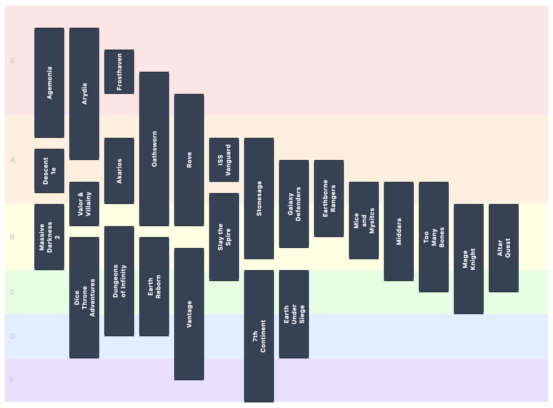
I rated my “Adventure Crawl” games list to test it out. You can clearly see that while Agemonia reaches the highest highs, its range is wide. Frosthaven, on the other hand, sits comfortably high with a tighter variance. And down in the middle, there is a massive messy clump of “good but not the best” games (Descent, Mice and Mystics, Massive Darkness 2) that are all effectively tied.
I thought it would be useful to share the generalized tool since it seems like it might be useful for other indecisive folks making tier lists.